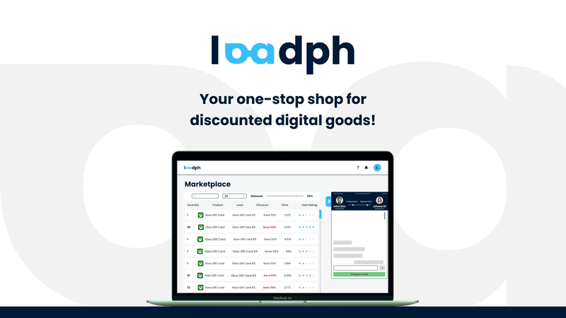
LoadPH was an output for our Thesis Writing 1 and 2 in collaboration with Eder Chua. The idea was for it to be a marketplace like Shopee or Lazada where users can post to sell, but for digital goods such as mobile loads, vouchers, coupons, subscription codes, etc.
This wasn't the first version of LoadPH. It was originally an output for another subject which included Paolo Tolentino in the group. He was the one who introduced the T3 stack and all the other tools, as he was already an experienced developer while me and Eder were just at the early stages of being a developer.
This project really expanded my knowledge in all aspects of development- from front-end to back-end- and introduced me to a lot more fields such as security, authentication, git control, market research, and more.
As a project for a thesis paper, every factors must be stated and polished, so this was a really tedious project to work on. Including the fact that we have panels that will curate and criticize every part of it.
Me and Eder decided to use the old LoadPH project for our research because we had this vision of expanding it in the future, and reckoned this was the opportunity to build the foundation of said idea. Because Paolo wasn't on our group anymore (he has other subjects), we had to remove some advanced codes that were too hard for us beginners to understand and work with.
I was tasked mostly on design and development, and Eder handled all social things like idealizing the business model, market research, interviewing potential customers, validating problems and solutions, etc.
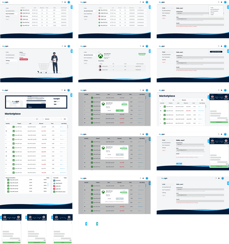
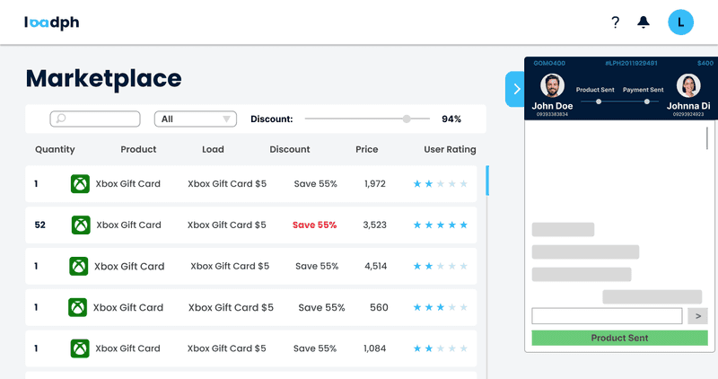
UI/UX
The UI was designed using Figma and developed using the T3 stack which primarily uses TailwindCSS as the style framework.
Branding
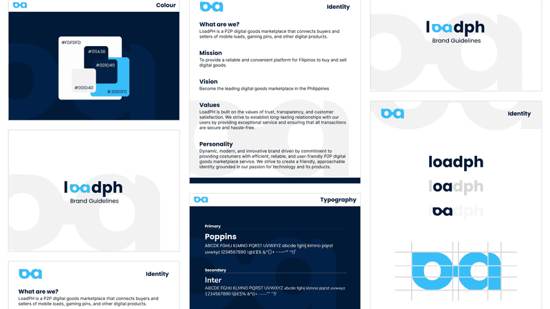
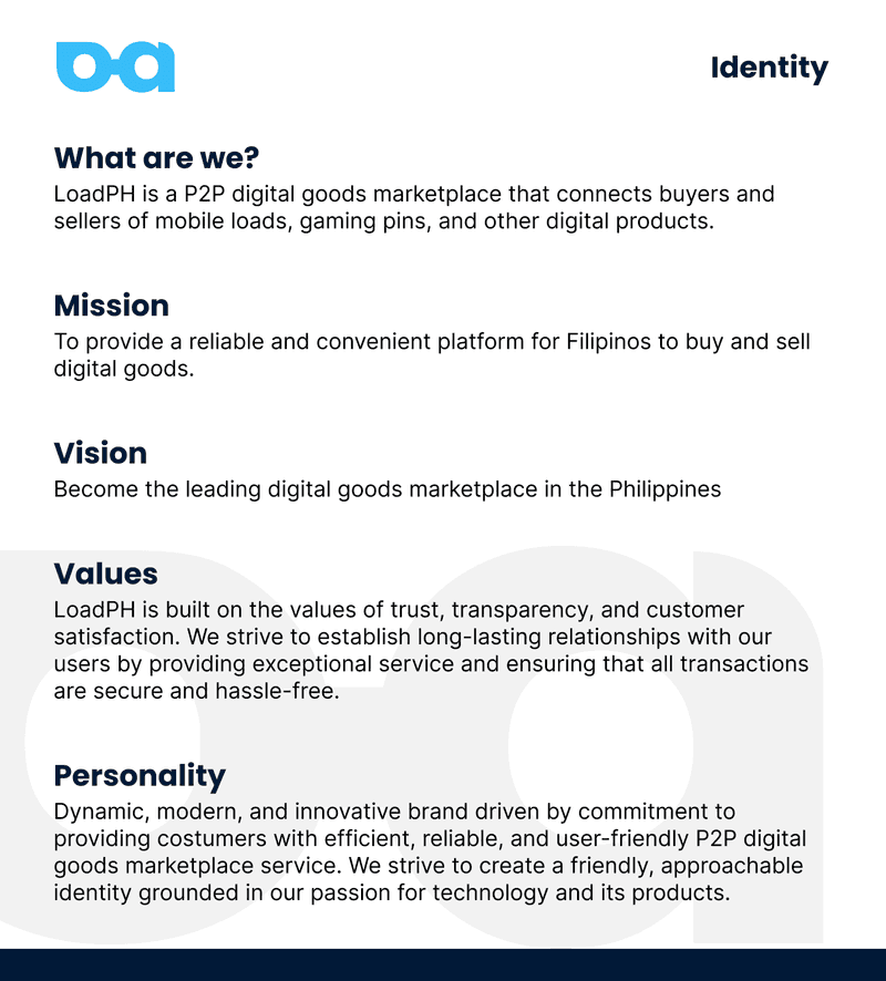
I made a simple brand guideline to give a little bit of face and identity to our project. It was definitely more inspiring to work on the project knowing that we see some sort of branding even if it was still unofficial.
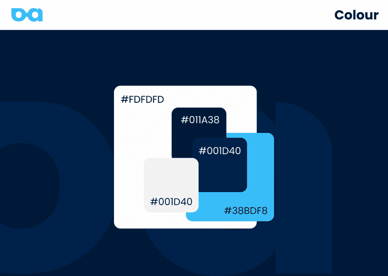
For the color palette, we decided to use blue as base color which signifies trustworthiness and secure. Additionally, we took inspiration from the colors of CIIT College of Arts and Technology as a nod to our school.
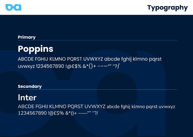
There wasn't really a deep explanation for the choice of typography. I just like Poppins because it's modern and clean. The secondary Intern font just adds a little bit of variety with regards to thickness.
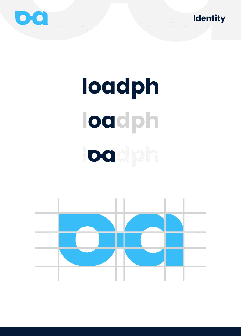
For the logo, we originally just wanted it to be a logotype, that is, just the word "loadph", similar to Paypal or Maya. I reckoned we still need something smaller in width to fit in a square icon. I experimented with the letter L but I wasn't happy with the outcome variations.
After a while I noticed the letters 'o' and 'a' kind of looks like an eye or eyeglasses and decided it looks good as a logo. I added some curves to lessen the hard edges, while also making it look like eyebrows.
